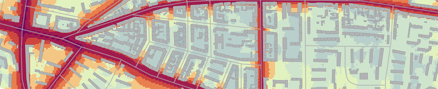
Colors have been used in cartography ”to label (color as noun), to measure (color as quantity), to represent or imitate reality (color as representation), and to enliven or decorate (color as beauty)” (Tufte, 1990: 81). In thematic mapping, such as traffic noise maps, color is used especially to represent a certain value. Colors are therefore arranged in a color scheme to represent a range of ordered values. Used properly, colors then have the power to reveal the structure within the data, but they can also contribute to misinterpretation if used carelessly.
Although color design seems to be straightforward, it is challenging. Monmonier (1996) even describes it as a „cartographic quagmire“. This is so because the perception of color depends on a variety of settings: ”All colors, whether they are seen as direct or reflected light, are unstable. Every change in light or medium has the potential to change the way a color is perceived. […] Not only are colors themselves unstable, ideas about colors are unstable as well” (Holtzschue, 2011: 11). In addition to physiology, also psychology and cultural background affect how people interpret color.
Based on cartographic rules (cf. e.g. Brewer, 1994) I recommend adherence to the following guidelines:
- Harmonical hierarchy: To represent partially or fully ordered data, colors should build a harmonical hierarchy (Jones, 2010: 46), i.e. lightness and saturation should in- or decrease systematically at one end of the scheme. Harmonical hierarchy is achieved in single-hue sequential schemes, or multi-hue sequential schemes that consist of hues that have a perceivable order, like yellow to dark-red, yellow to purple, or yellow to dark-blue.
- Match values or class distances and color distances: Besides ordering type and continuity type, an additional data characteristic is the distance of elements (Andrienko et al., 2006). Logarithmic data is special in that it appears to be equidistant, although classes of the antilogarithms would not be equidistant. Equidistant color schemes might give a wrong impression as classes with higher values would be underrepresented. Therefore, an increase in saturation was achieved in the presented scheme.
- Consistency of colors: Consistency of colors on a variety of output devices is a major goal. The aim is to use colors that can be recognized regardless of object size, adjacent colors, or device in use and enable a correct assignment of the object colors to the color patches in the legend. I recommend the use of different hues in a harmonical hierarchy and fewer steps in lightness per hue – in contrast to single-hue palettes with a high number of classes – to support the recognition of colors.
- Suitability for color vision deficiencies: Avoid colors that are not suitable for color vision deficiencies, especially the combination of red and green. It already supports readability to increase a color’s blue portion.
Sources
Andrienko N, Andrienko G (2006) Exploratory Analysis of Spatial And Temporal Data: A Systematic Approach. Springer, Berlin, Heidelberg, New York
Brewer C A (1994) Color Use Guidelines for Mapping and Visualization. In: MacEachren A M and Taylor D R F (eds) Visualization in Modern Cartography. Elsevier Science, Tarrytown, NY
Holtzschue L (2011) Understanding Color: An Introduction for Designers. Wiley, Hoboken, New Jersey
Jones C E (2010) Practical Cartography. In: Haklay M (ed) Interacting with Geospatial Technologiess, John Wiley & Sons, Chichester
Monmonier M (1996) How to Lie with Maps. The University of Chicago Press
Tufte E R (1990) Envisioning Information. Graphics Press, Michigan